
Dagger Coffee Co.
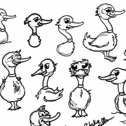
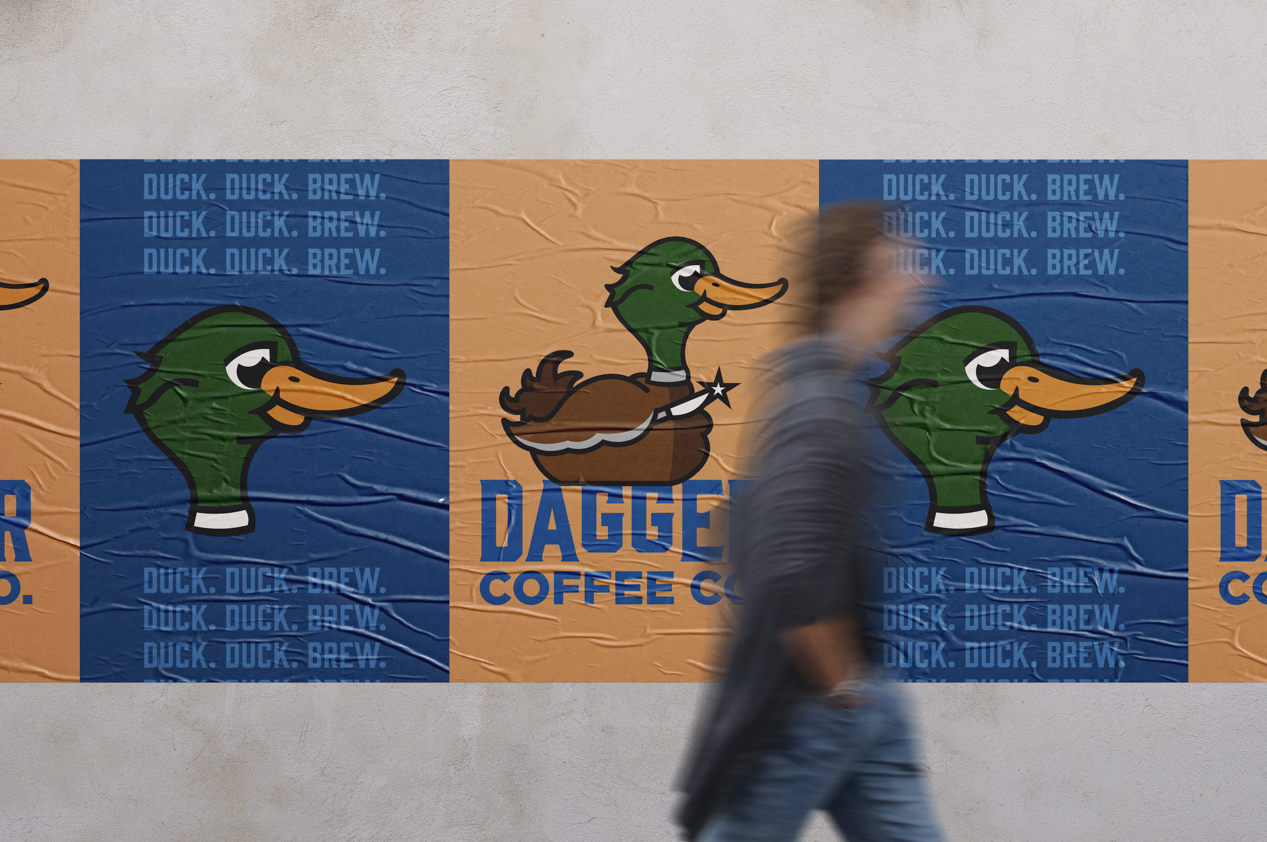
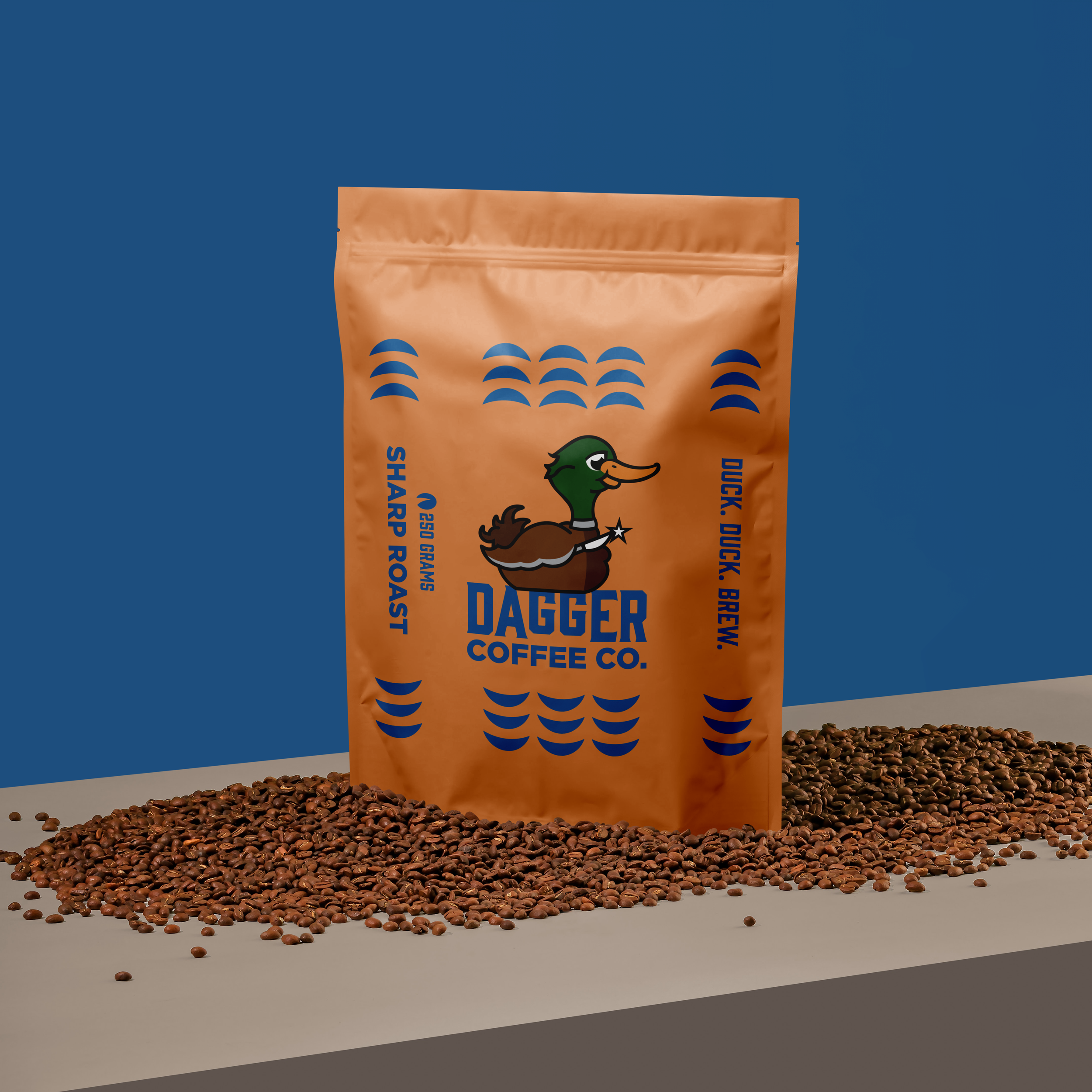
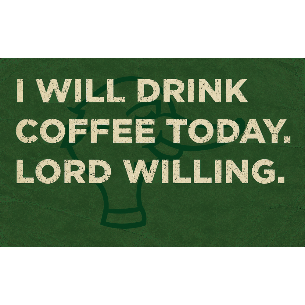
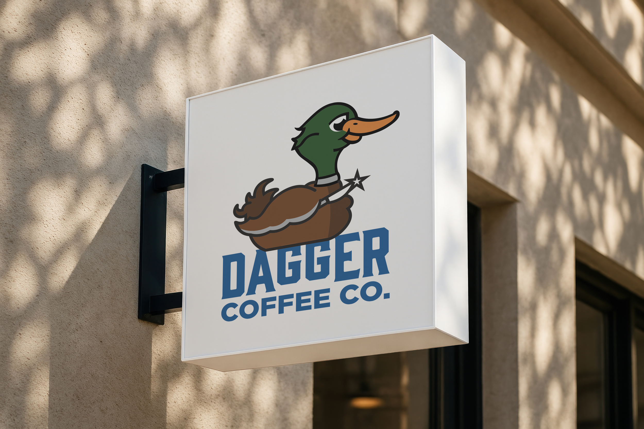
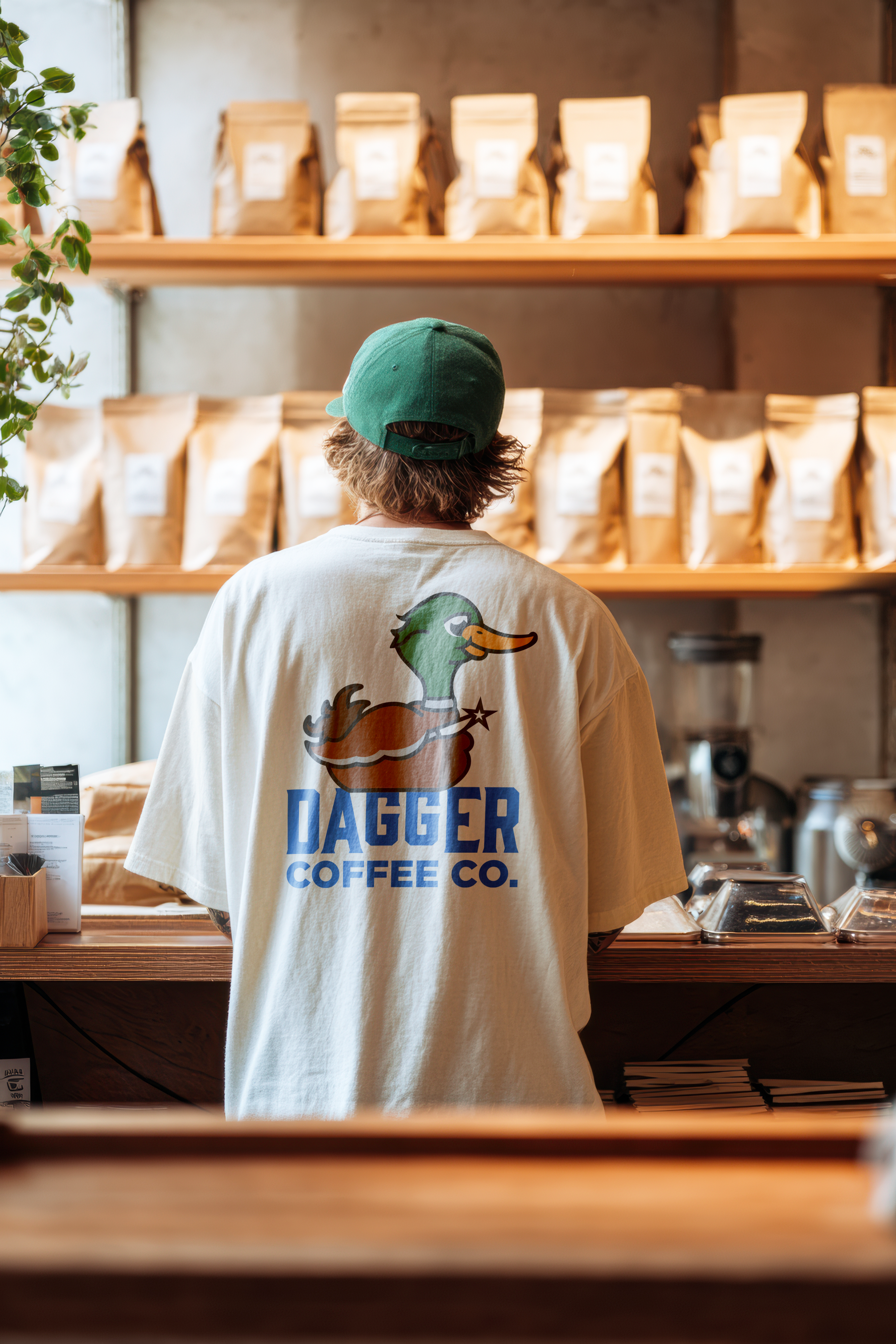
The Dagger Coffee Co. branding project began with sketching and exploring different mascot concepts before refining the design into a bold, recognizable duck logo. As the process evolved, unnecessary details were removed to create a clean, versatile mark that could be used across a variety of applications. The final identity was then applied to packaging, apparel, signage, and promotional materials, resulting in a cohesive brand system that captures the company's playful personality while maintaining a strong visual presence.
create a Restaurant
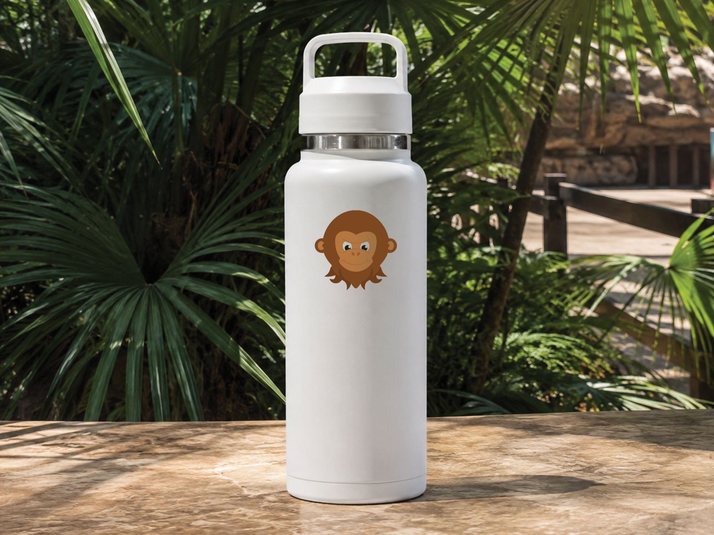
Adobe Illustrator is the foundation of my graphic design practice, and this project reflects how much my skills have evolved since my time at Louisiana Tech University. When I first created these animal illustrations, I was still developing my understanding of vector illustration and relied heavily on hand-drawn techniques. Looking back, the original versions always make me smile. I value them because they remind me to preserve a sense of curiosity and playfulness in my work. Revisiting this project allowed me to challenge myself, refine my craft, and see just how far my abilities had grown.

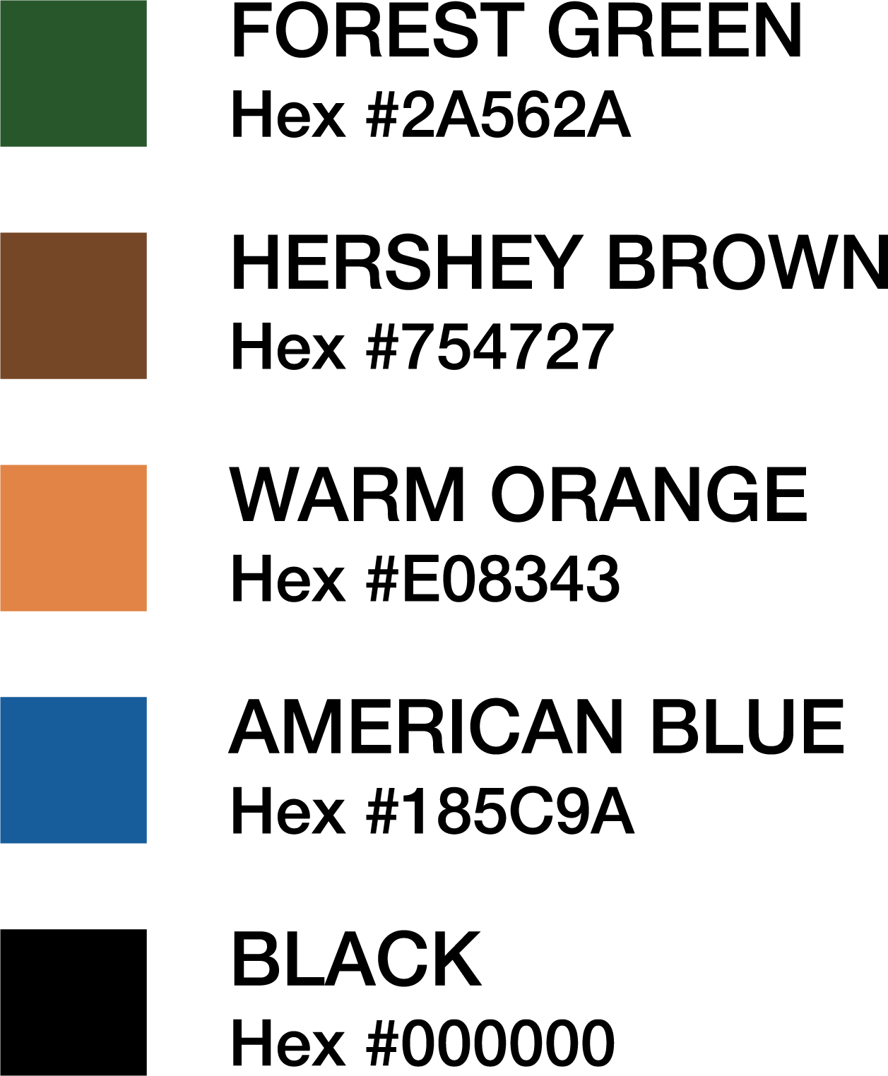
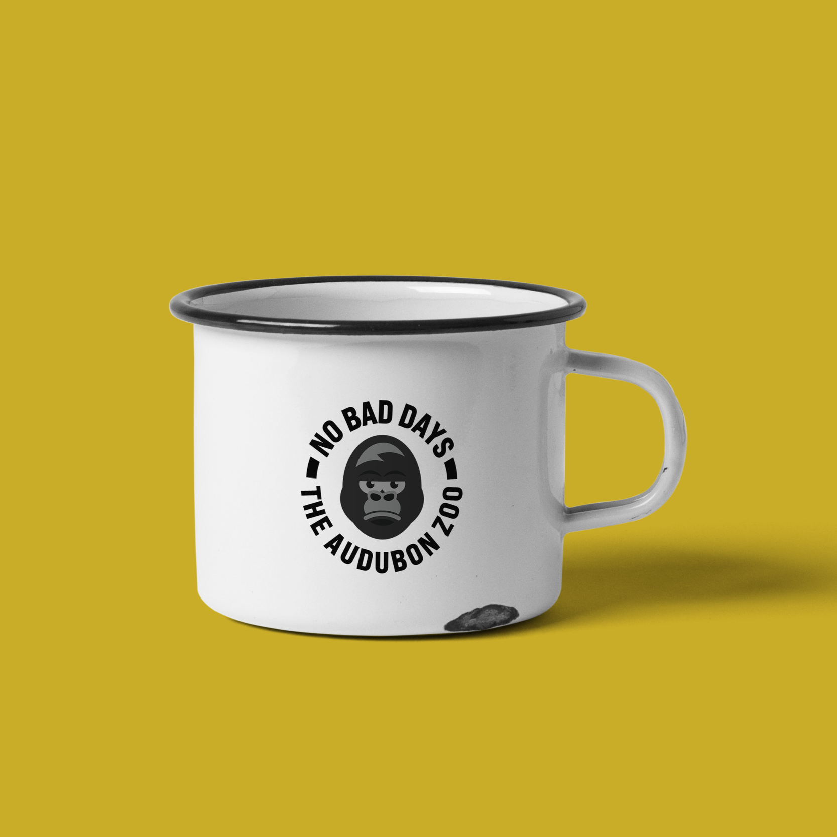
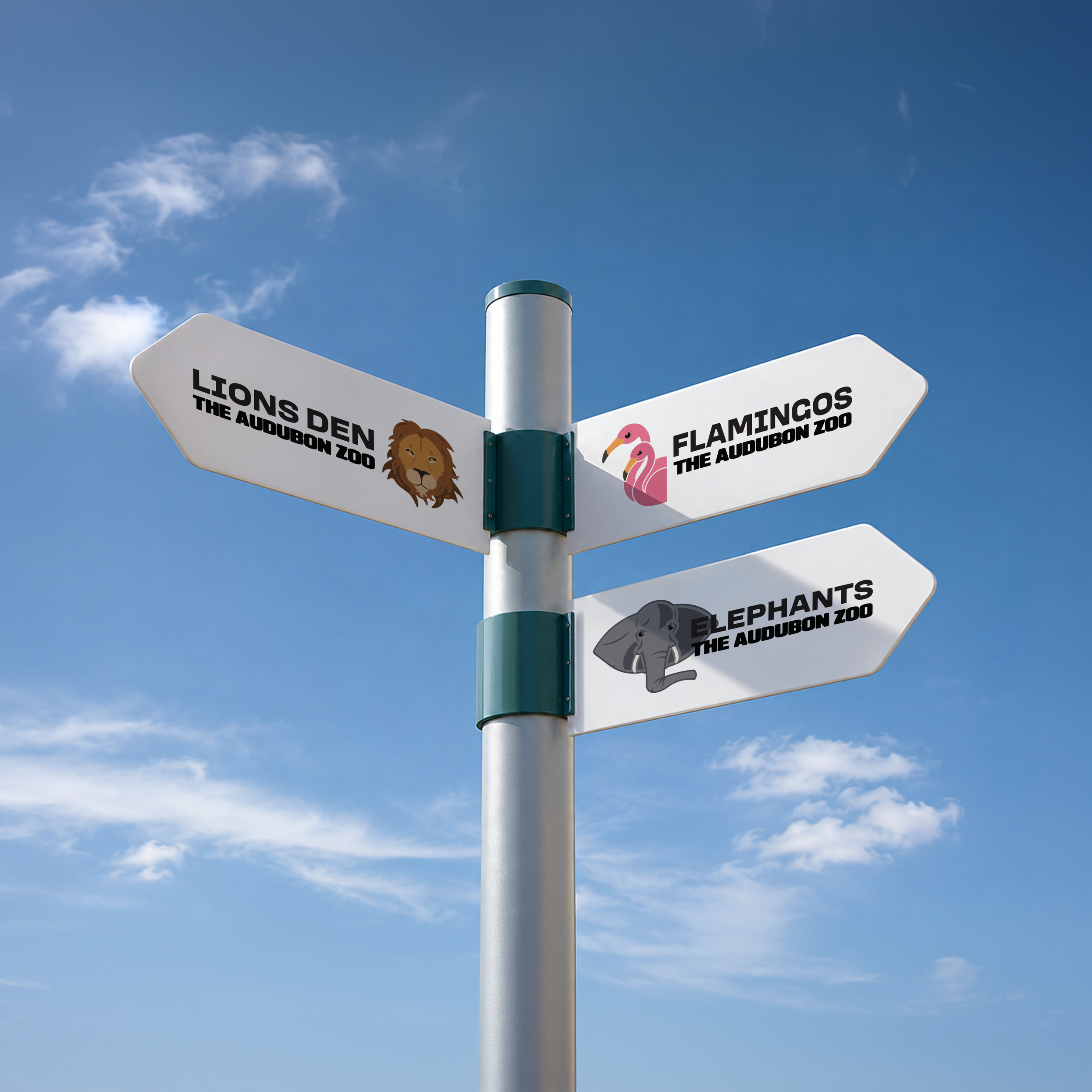
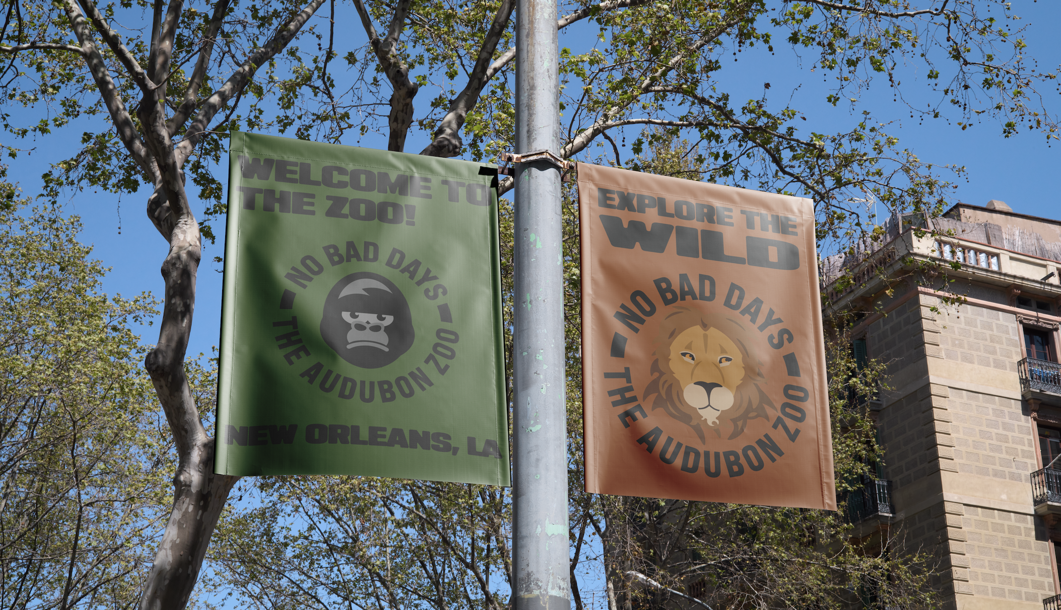
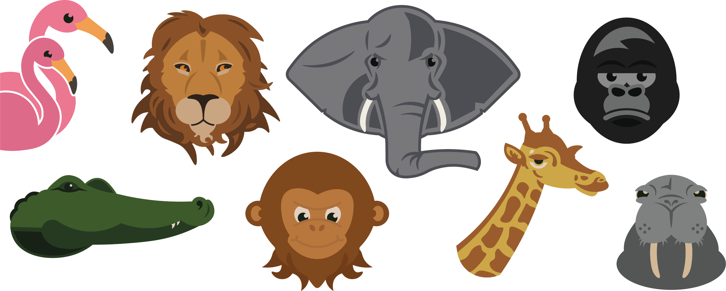
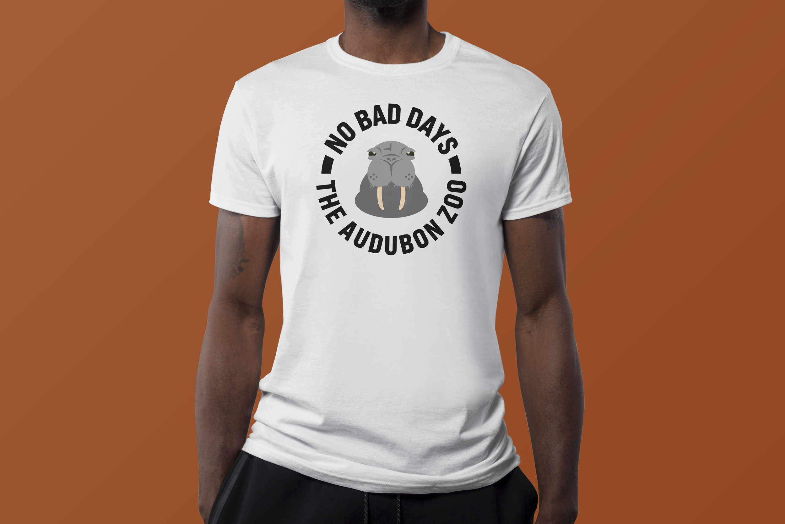
In Symbols + Marks, we were challenged to redesign the Audubon Zoo's wayfinding system by creating a modern set of animal symbols. The solution was to develop a cohesive set of animal symbols that are easily recognizable and adaptable across a variety of applications. The symbols work together as a unified visual system, improving navigation while giving the Audubon Zoo a refreshed identity.

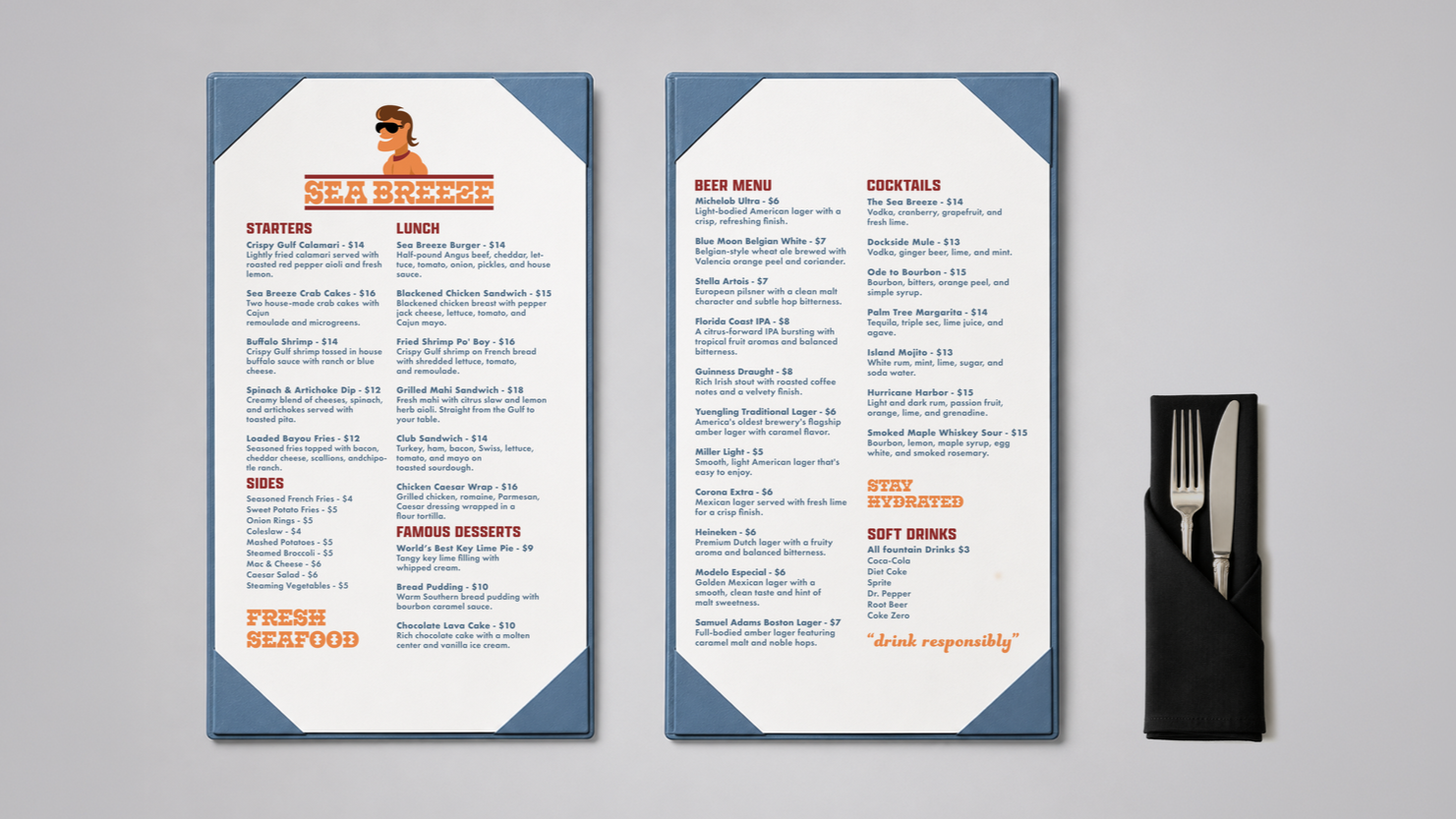
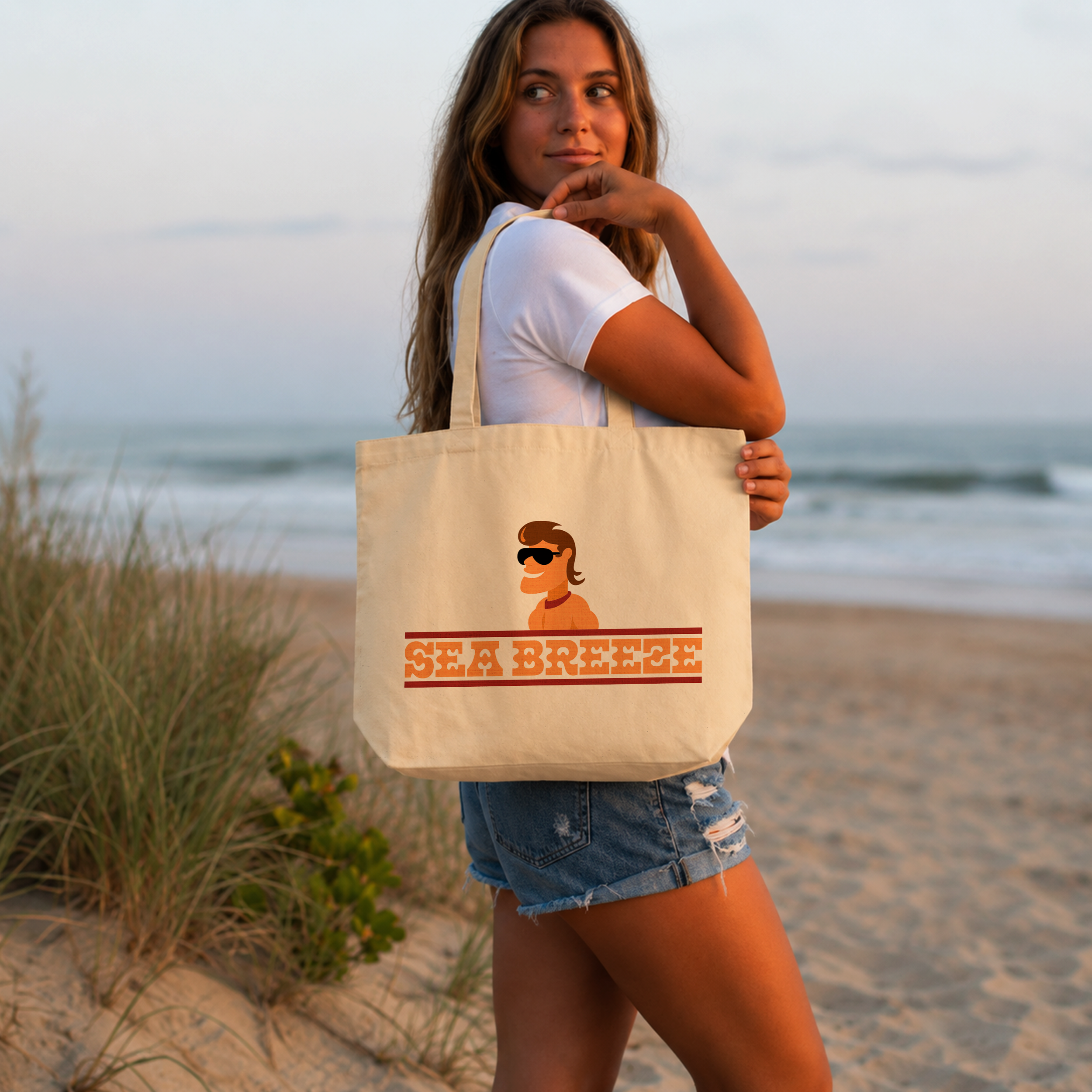
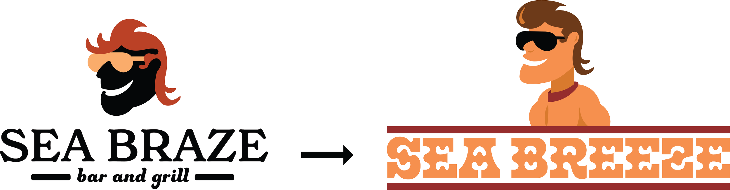
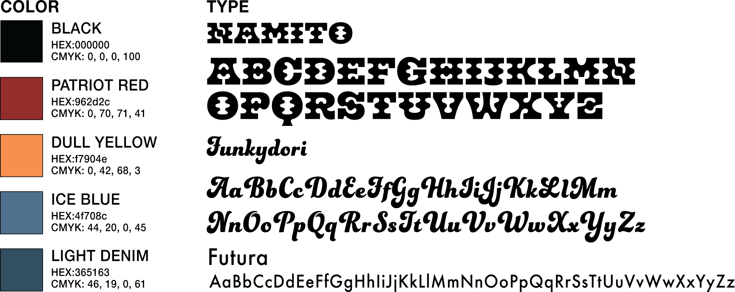
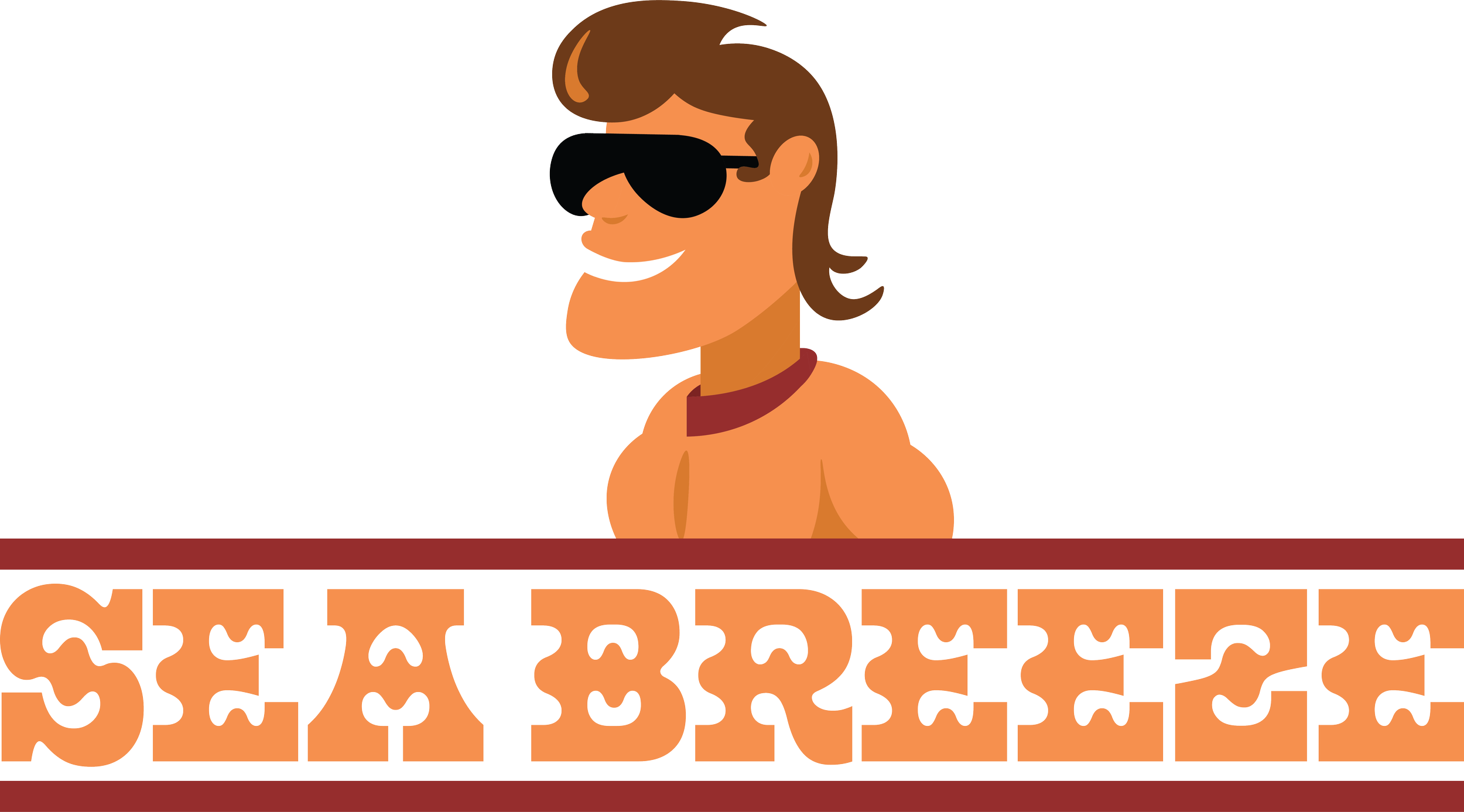
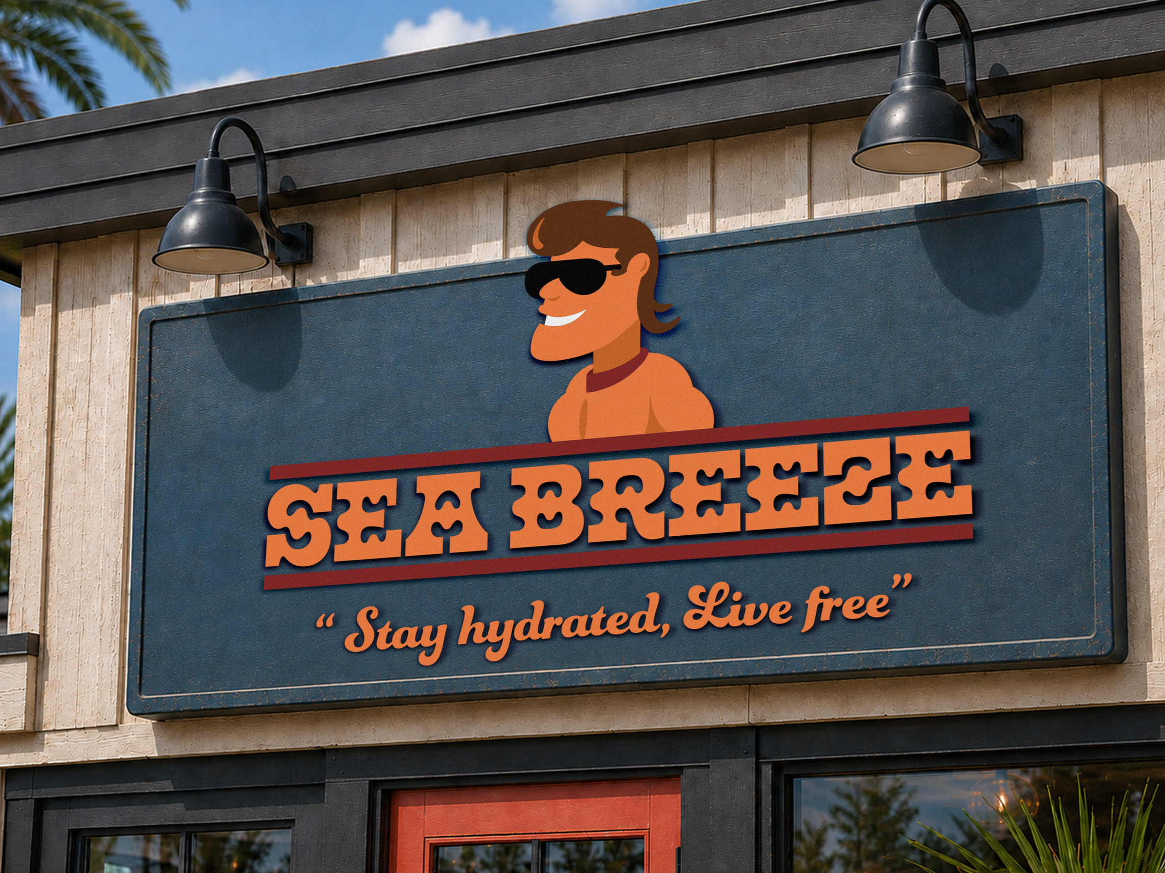
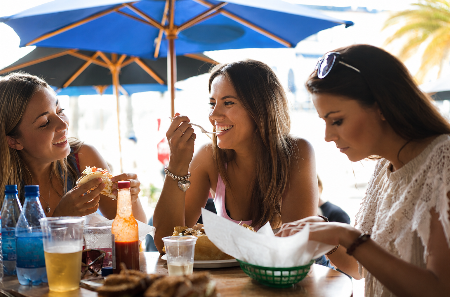
The execution of the Sea Breeze rebrand centered on creating a cohesive visual identity that could be carried across every customer touchpoint. After refining the logo and establishing a coastal-inspired color palette, I applied the brand to a wide range of materials. Each element was designed to reinforce the restaurant's relaxed, family-friendly atmosphere while maintaining consistency in typography, color, and layout. By extending the identity beyond the logo and into practical, real-world applications, the rebrand transformed Sea Breeze into a recognizable and inviting dining experience.
What is howdy gator?
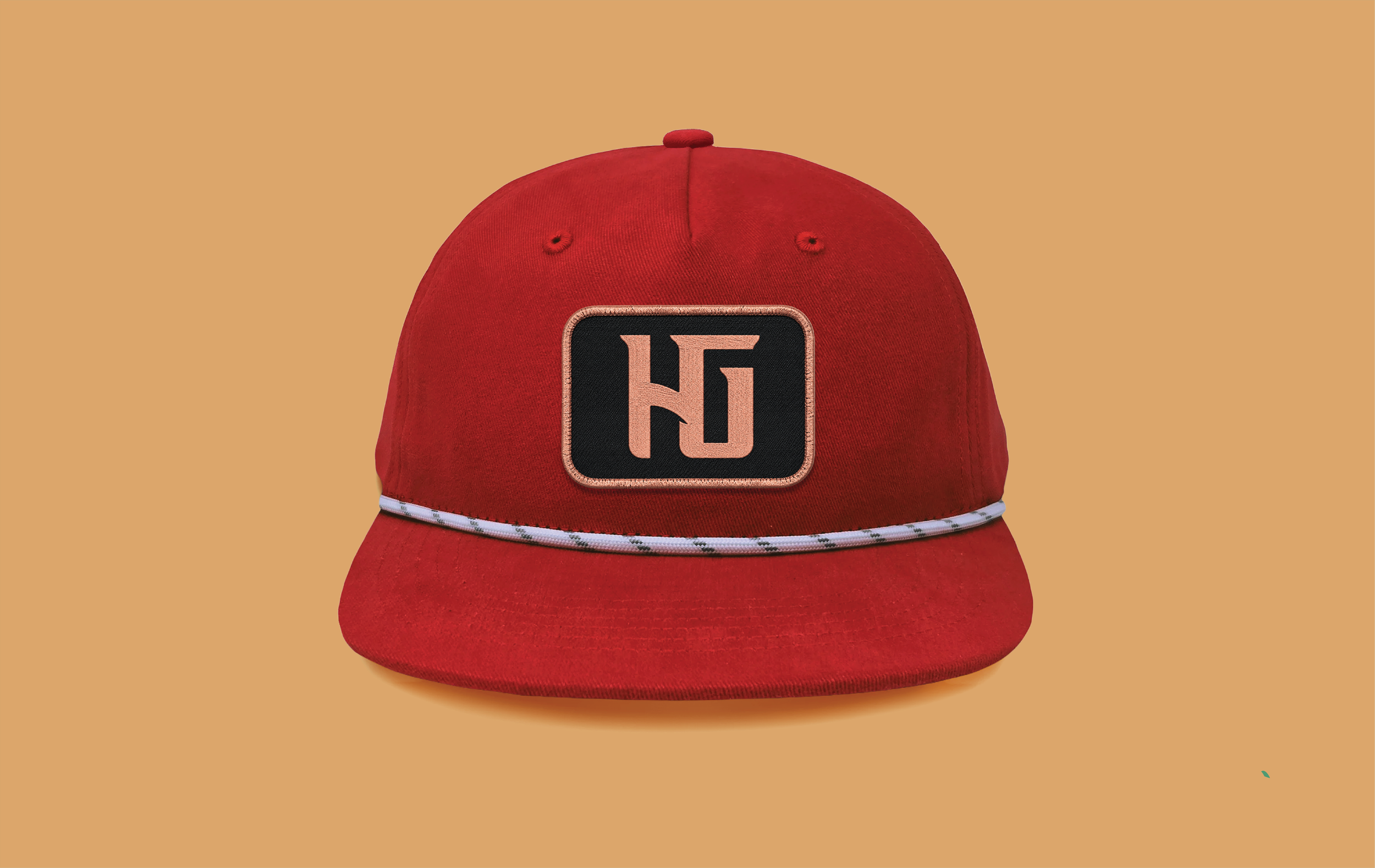
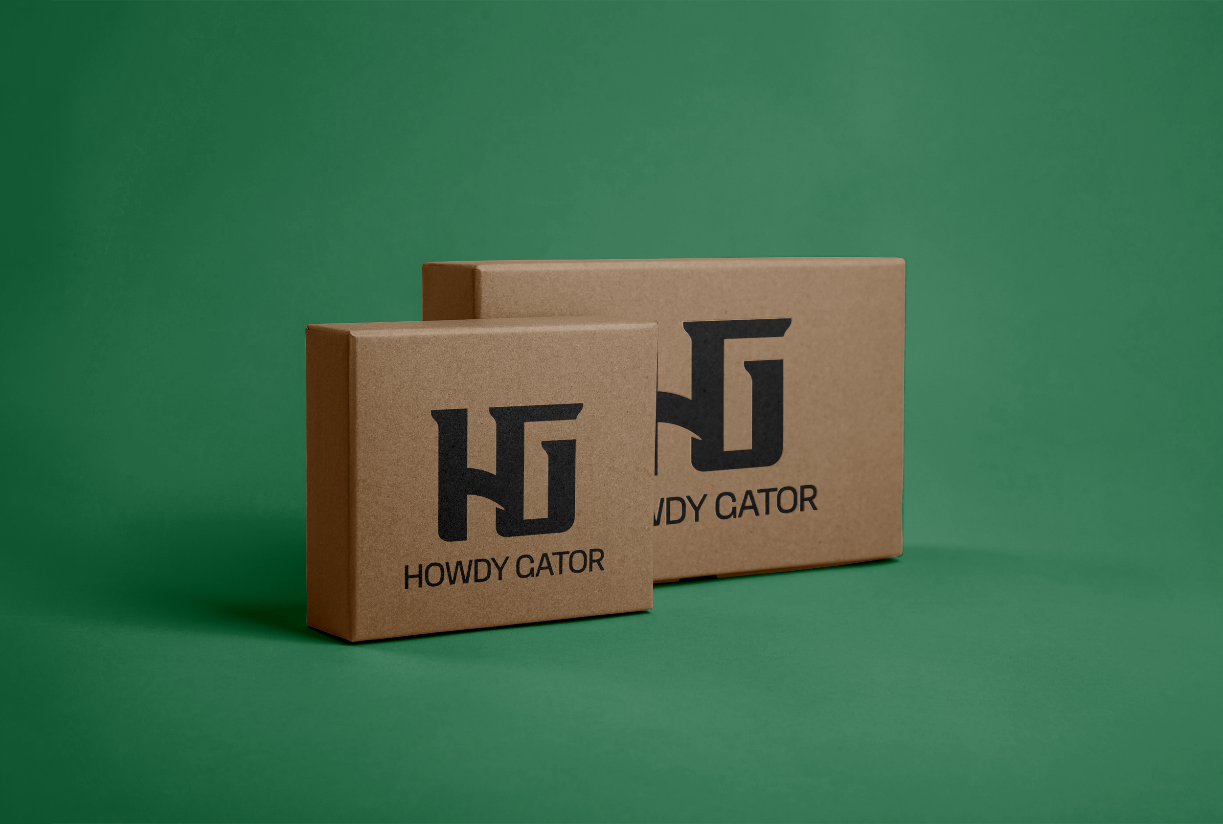
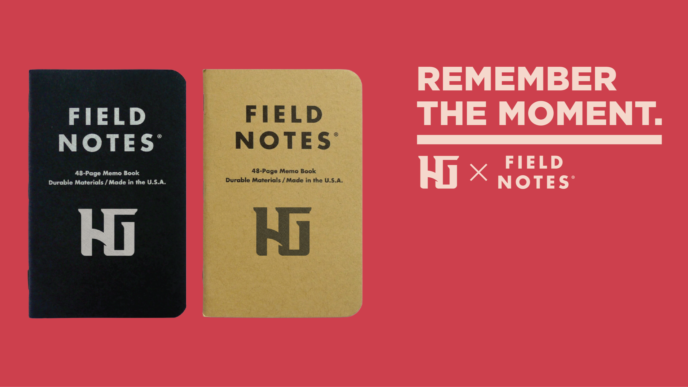
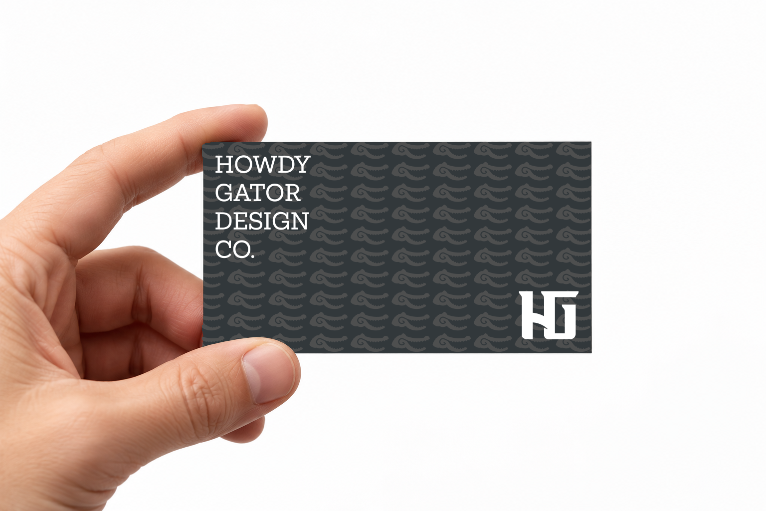
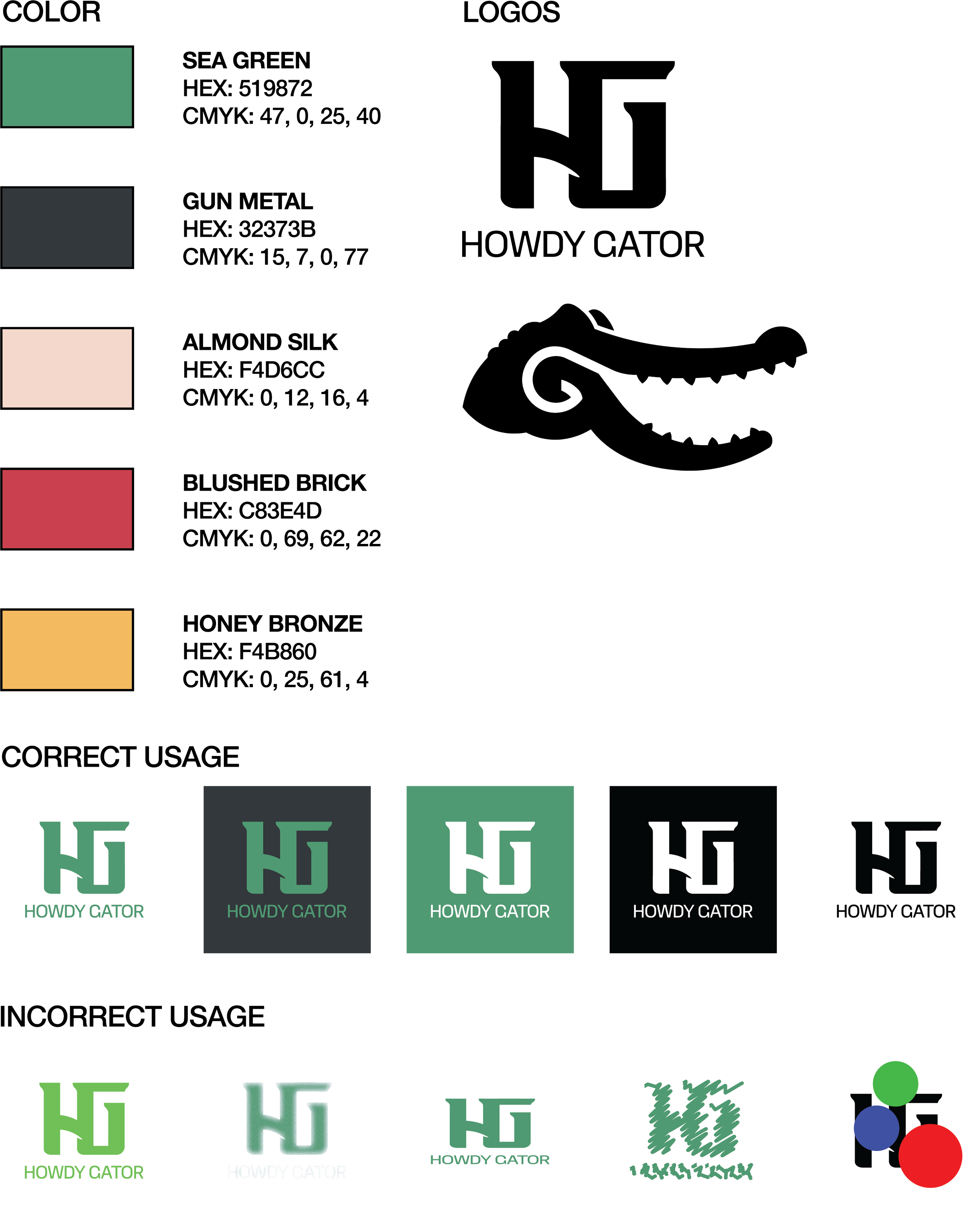
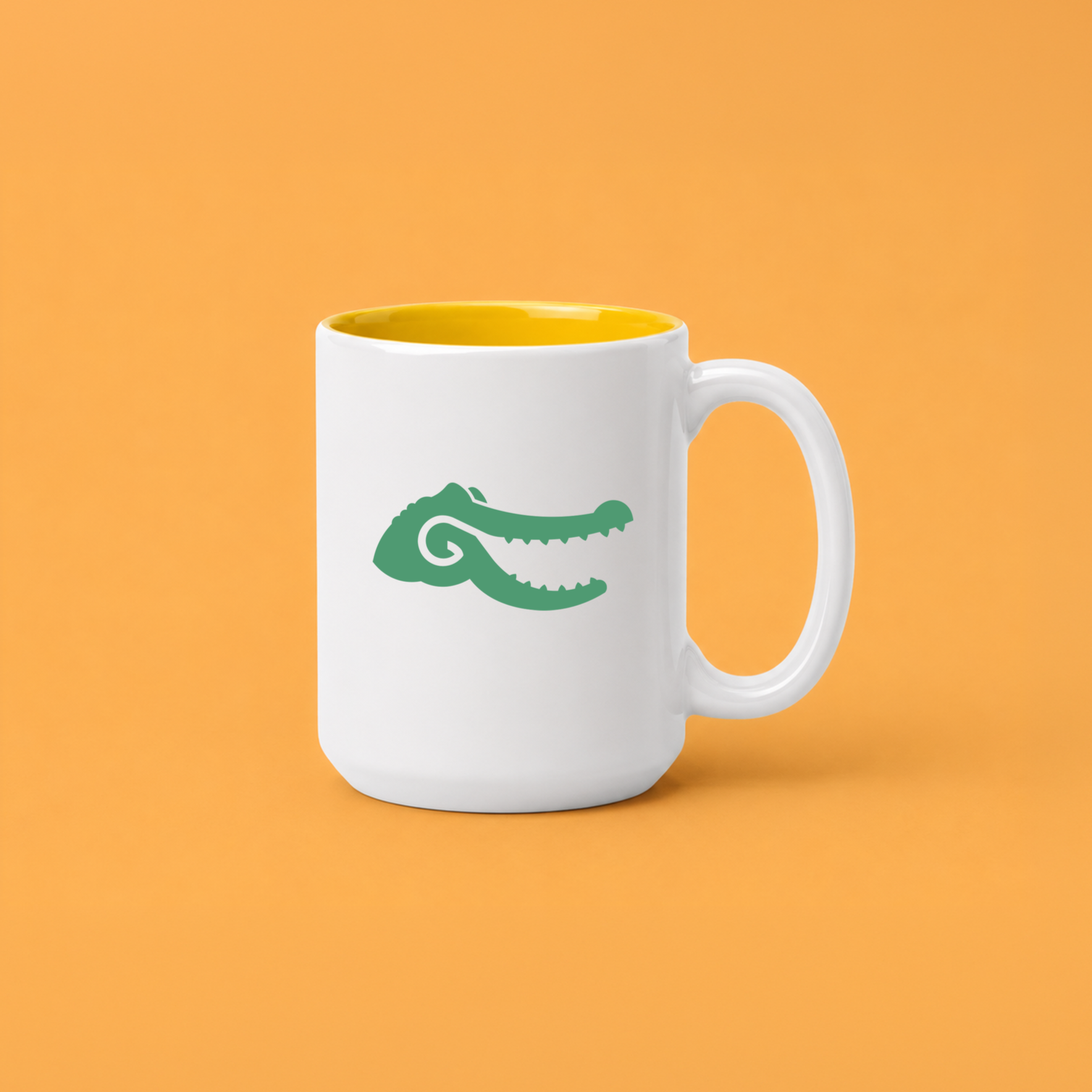
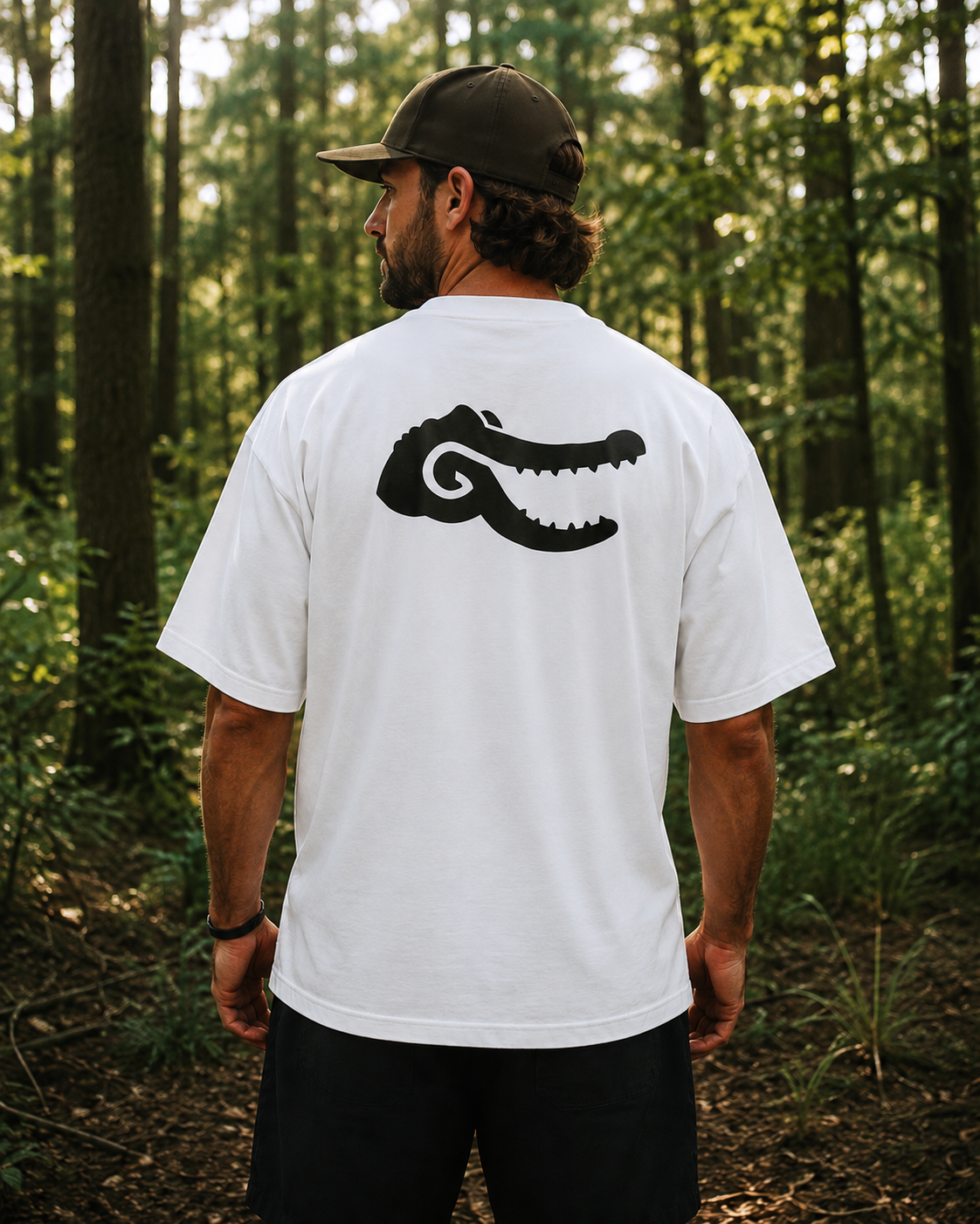
The Howdy Gator project was created as a playful brand identity centered around Southern hospitality, combining a friendly alligator mascot with clean, approachable design. Beginning with early concept sketches, I explored different character styles before refining the mascot into a simple, memorable mark that balanced personality with versatility. Throughout the project, I developed a cohesive visual identity by applying the brand across a variety of real-world touchpoints, including packaging, merchandise, signage, and promotional materials. The final result demonstrates my ability to take a concept from initial sketches to a polished branding system that is both engaging and functional while maintaining a timeless, family friendly appeal.

CLEAN THE ANIMALS!